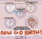
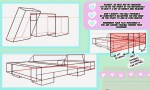
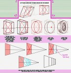
It’s Meg for this week’s TUTOR TUESDAY! I’ve been wanting to cover perspective again for awhile because my old tutorial is…well…let’s just say I’ve gotten better at formatting these. Plus there’s so much more to learn! If you have any recommendations send ‘em in here or my personal! Have fun, keep practicing, and I’ll see you next week!
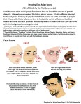
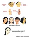
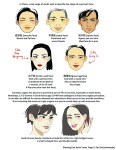
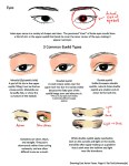
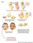
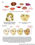
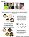
A compilation of stuff I know about drawing Asian faces and Asian culture! I feel like many “How-To-Draw” tutorials often default to European faces and are not really helpful when drawing people of other races. So I thought I’d put this together in case anyone is interested! Feel free to share this guide and shoot me questions if you have any! I’m by no means an expert, I just know a few things from drawing experience and from my own cultural background.
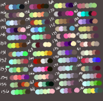
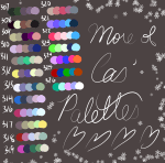
I have a lot of palettes lol
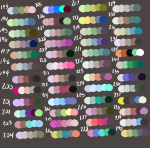
Putting this here for later because I’m switching devices soon and I gotta save these ♡ feel free to use as usual
If you have character requests I’ll consider them uwu
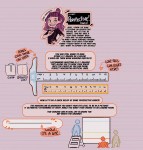
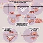
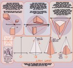
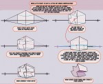
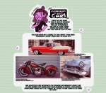
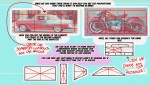
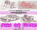
It’s Meg for this week’s TUTOR TUESDAY! Today we look at cars! if you have any recommendations send em in here or my personal. Keep practicing, have fun, and I’ll see you next week!
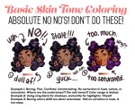
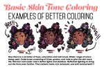
Someone asked for a few tips regarding coloring skin tones so I threw this together real quick lol.
Obviously not an end all, be all — and in NO WAY covers the plethora of info regarding this topic. Just a quick guide from my perspective. One day I’ll make a tut more extensive and organized with way better examples 😭
For those wondering about HOW to do this, here’s a short explanation according to me:
Drawing A to Drawing B: -the most obvious change is the exaggeration of the line of motion in the character.
In Drawing B the line of motion is much more pronounced, creating more drama and movement to the whole composition
-The arms are open wider, showing more confidence and exuberance in the character, exaggerating their emotions so they can be more clearly read without having to look to the face for emotional cues.
-the legs are wider apart, adding to the aforementioned confidence but also giving the character a solid foundation, visually speaking.
-The head is tilted back and overlapped by the chest, adding a touch of dynamic perspective to the drawing.
Drawing B to Drawing C: -Most obvious change is to zoom in on the character. Character framing is just as important as what the character is doing. Zooming in can help infensify emotions. this shot is ALL about this character and what they’re feeling. -Because of the zooming in, the arms/hands would have gotten lost, so instead of making the canvas wider, the artist has elected to rotate the character slightly, bringing a dynamic angle to things and more intensity to the close shot. -While the character is more upright in this shot compared to Drawing B, in Drawing C the chest still slightly overlaps the neck, preserving the feeling of being slightly below the character (putting them in a position of power relative to the viewer), which helps maintain confidence and power in the character. -the chest is exaggerated to carry the majority of the body’s line of action so even though you cannot see the legs, our brains are able to fill in the gap and envision that line of action. -The cropping/framing of the character allows for a more interesting composition/negative shapes created by the positive (character) on the negative (background), creating more visual interest as well as a circular motion to the composition through the arms, across the face to the negative space for the eyes to rest in before dropping to the hand in the background and back through the composition again.
DID YOU DISSECT MY DRAWING TO FIND OUT WHY IT WORKS?? I LOVE YOU. I LOVE YOU. THANK YOU SO MUCH
ALRIGHT, so, I know a lot of people have trouble making eyes match. Yesterday I found out a way to make it significantly easier! Here’s a small guide.
Well, first of all, you have your face. mark where the eyes should be on it.
Then mark the corners of the eyes and go over the middle again, to make the next step easier
Alright, I know it sounds a bit crazy, but draw this shape, trying to make it as symmetrical as you can.
Draw the eyes using that shape as a guide and TA-DA! They match! For different eye shapes you tweak the angle of the two guide lines.
And it also helps with angles where the size and shape of the eye is distorted, you just put it in perspective.
I think the theory behind it is that the thing that makes it hard to make the eyes match is the angle of the corners, and this type of guideline helps make them even, which makes the eyes look symmetrical. Welp, here it is! I hope it helps someone!
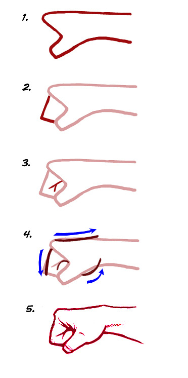
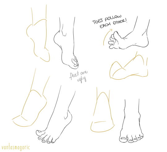
thank you a lot anon!! ( /)w() here, i made a few notes about the steps i follow while drawing feet:
^ that’s assuming you’re not drawing from a low perspective, as if the camera was on the floor or something like that!
SORRY MY HANDWRITING SUCKS and i’m not really good at explaining things bc i don’t really follow a guide and stuff so yeah BUT I HOPE IT WAS HELPFUL TO YOU!!
Feet Every artist’s mortal enemy at some point in their life