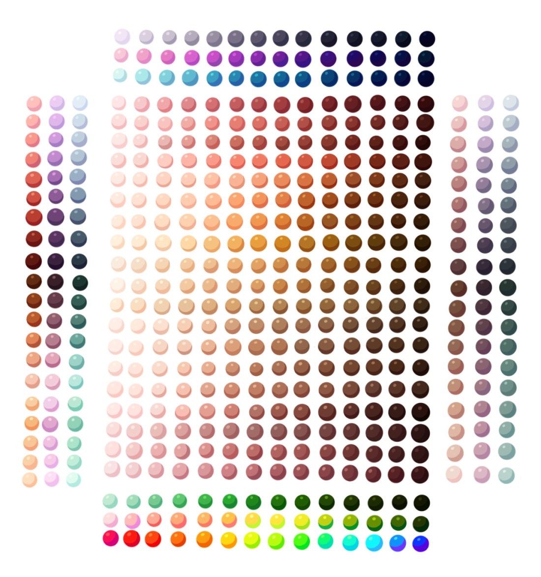
I wanted to recolor something but didn’t want to do it manually (I’m lazy…I know…but hey its cool) so here are two ways I learned to recolor grey scale art
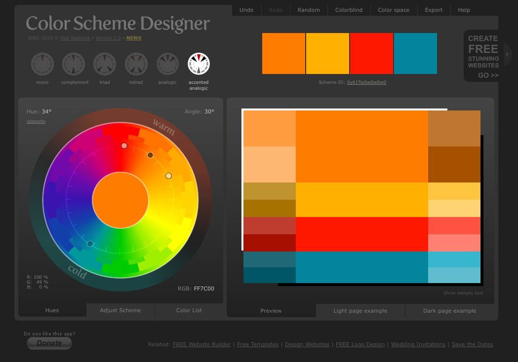
1. Gradient Maps
In Photoshop, go to Image > Adjustments > Gradient Map
Here, you can apply preset gradients to your pieces by selecting them in the drop down.
(There are some rather interesting choices, as you can see from the random one I selected)
By clicking the gradient bar itself, you can edit the gradient you have selected, create a new one, or load in other presets. Just make sure the gradient type is Solid and not Noise, it won’t let you edit the colors if it is set to Noise. This method is helpful if you’re doing a palette challenge.
Here’s some of the results I got messing around with it:
2. Prisma
Prisma is amazing. Its and app, I thiiink it’s originally made to edit instagram picures, but it can do a lot more than that
You select a picture in the app, and from there you can select and test out different styles on it. Some work better on certain works than others do, experiment a bunch. Each one takes a couple minutes to load, but its worth it
Here’s some of the styles I liked:
I’m sure you could combine both of these methods, but I haven’t tried that yet. Could be interesting
That means free access to Photoshop CS2 – and that already has most of what you could ask for, really.
All you have to do is create a FREE ADOBE ID.
I am not sure about commercial use, but MAN. FUCKIN’ SWEET DUDE
Reblogging for the greater good.
I’m unlikely to pick it up as I honestly never use PS anymore, but here everyone who follows me. Free stuff.
oh wow this is perfect i was just lamenting that i’d have to buy creative suite for my new laptop WELP
Signal boost for any of my followers who need art programs!
The cs2 programs date back only a few years, and still have much of the functionality of today’s more modern ones. The differences between most of the versions are little more than slight modifications or additions of minor features, and UI changes. Go for it guys!!
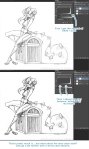
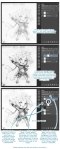
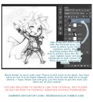
ALRIGHT, so, I know a lot of people have trouble making eyes match. Yesterday I found out a way to make it significantly easier! Here’s a small guide.
Well, first of all, you have your face. mark where the eyes should be on it.
Then mark the corners of the eyes and go over the middle again, to make the next step easier
Alright, I know it sounds a bit crazy, but draw this shape, trying to make it as symmetrical as you can.
Draw the eyes using that shape as a guide and TA-DA! They match! For different eye shapes you tweak the angle of the two guide lines.
And it also helps with angles where the size and shape of the eye is distorted, you just put it in perspective.
I think the theory behind it is that the thing that makes it hard to make the eyes match is the angle of the corners, and this type of guideline helps make them even, which makes the eyes look symmetrical. Welp, here it is! I hope it helps someone!
“I couldn’t find any pictures that are-” is a very lousy excuse to whitewash PoC. There are plenty of PoC models, stock images, and editorials out there. You just have to find it. Here are some of the blogs that are dedicated to PoC editorials/models that I follow. Feel free to add and suggestion more.
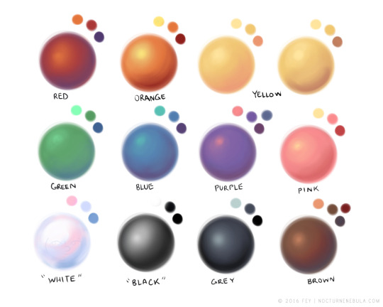
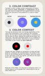
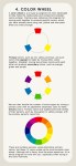
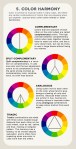
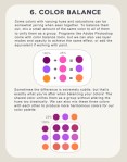
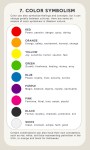
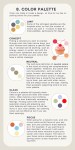
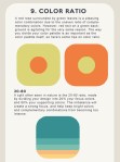
There is no right or wrong in color and design, and everyone works differently, but hopefully these tips of mine will help you find the colors that make you happiest!
Absolutely stunning color tutorial, which is great for many kinds of artists!
Be sure to reblog and follow @salison
So their great work gets the attention it deserves.
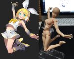
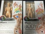
OKAY THESE ARE AMAZING AND ALL BUT WITH MY LUCK I WOULD JUST
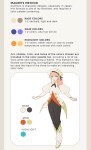
There is actually a free program everyone can download called DesignDoll which has unlimited posable models if you need more then just two or just simply don’t have the money to buy these figurines. The program is easy to work with and I’d recommend it to everybody!