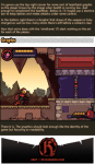
SHORT STORY/ONE-SHOT/ONE CHAPTER/COMICS 101 CRASH COURSE RAPIDPUNCHES’ STYLE
I’m NOT an expert but I have some working experience I can share. You need experience to become great. Here is my set of instructions, tips, and notes towards making a 12-page comic.
My method is to work backwards. Personally I work “backwards” because the end is the only wholly necessary page or set of panels in the story. Everything in between is open to editing and hacking as the most important moments are emphasized and chosen.
I even plan/draw the end page first. The end is the last page a reader sees- so spend your freshest energies on making it as epic, memorable, poignant, and beautiful as #$%^&.
If you draw the pages from 1 to 12 sequentially you run the risk of fresh to burnt out- an uneven distribution of drawing skill. (treat the first page and the 2-page splash as you would the last).
Roughly… the steps to making your comic is
WRITE
PLAN THUMBNAILS
DRAW
…BEGIN THE WRITING (DO NOT SKIP NO MATTER WHAT) like this, in this order:
How does it end?
Does the protag succeed or fail?
What is the turning point of their story?
What the protag do that led them there?
Where does it start?
Who is this protag?
EXAMPLE:
Guy gets mauled by a bear.
This is a fail on the guy’s half.
The bear must eat something or he’ll starve to death.
It’s the guy’s fault the bear can’t find other food. He caused the avalanche that buried all the cabins.
The guy is yodeling in an avalanche zone.
The guy is some guy.
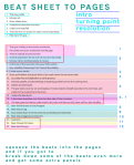
CREATING “THE BEAT SHEET” Take the above stuff and reorder it to make sense.
This guy yodels.
Echoes roll.
Snow slides down.
Avalanche buries the mountain.
Cabins are engulfed.
This bear has no access to cabin food and garbage.
Bear eats this guy.
Expand. Blow up important beats for emphasis. Keep less important beats brief.
This guy is hiking in the snowy mountains.
He comes across an avalanche warning sign.
There is nobody around but him.
A dumb expression forms over his face and he yodels.
Echoes roll but nothing nearby is moved.
At the top of the mountain the snow drifts twitch.
Guy, satisfied, hikes away from there still yodeling.
Frozen snow cracks.
Snow puffs billow and great slabs of ice crash down the mountain side.
Guy sees this and hightails it to safer ground.
Animals, people, are all panicking and getting pushed over by the rushing snow.
Cabins are destroyed.
The guy takes cover by an outcropping of rocks, fastens himself securely to the rock face, and waits for the avalanche to die down.
Avalanche dies down.
A lone bear shambles over from the other side of the mountain.
The bear goes to where a cabin used to be (only roof tiles are left). Bear sniffs a dish satellite.
Bear forlornly eats a food wrapper.
Bear tries to dig.
Guy comes down from the rocks he as climbing and sees bear.
Bear stops digging and sees him.
Guy runs.
Bear chases him down.
Bear eats the guy.
BEAT SHEET COMPLETED!!!
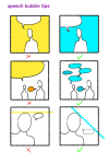
After the beat sheet, write up all the sound effects and speech bubbles and conversation/dialogue you want to be in your comic.
Since comics are a visual medium, highest priority is given to the beats. If a story can’t be told with the art without the dialogue– you messed up and it’s time to rethink your life choices.
Try to keep all your text chunks as short as a tweet. Professionally you don’t want more than 25 words per speech bubble and no more than 250 words per page.
Next is translating the beats to pages…
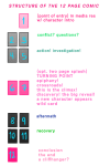
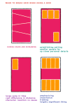
STRUCTURE OVERVIEW:
[1] point of entry, in media res, hero intro
[2][3] conflict. establish conflict, setting, and mood by the third page. [4][5] rising action/false resolution to conflict/investigation
[6][7] turning point/plot twist/epiphany (this one epic image, to page spread is pivotal, spend a lot of effort into creating this)
[8][9] aftermath/“darkness before dawn”/struggle [10][11] recovery/“rise and conquer”/“fall”
[12] resolution/final end/cliffhanger
[front cover][interior] [interior][back cover]
——————–
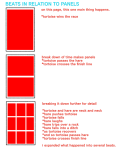
My maximum per page is nine panels but I’ve seen pages that have way more. I like to have about 3 to 4 panels per row or less but I’ve seen the “rules” broken before. Advanced comic book artists manipulate time with the number of panels and the size of each panel.
remember, DIAGONALS!!! open up an issue of batman, superman, spider man, deadpool or whatever youre reading theyre everywhere.
———-
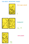
…DRAW IN THIS ORDER:
Page 12,
Page 6 and 7 (this is typically one large image that takes up the space of two pages),
Page 1,
and then the rest.
ONLY “DEVIATION” ALLOWED:
Page 12 and 1*
Page 6 and 7,
and then the rest.
*Draw the first and last page as a spread in situations where the beginning of the story mirrors the end of the story.
Cover is dead last.
———-
(If at the very end you find out you need more pages and it’s absolutely unavoidable and totally necessary you have to add them in fours. Try to stick to 12 pages for this crash course.)
——————–
FURTHER NOTES:
Plan and draw the pages in spreads (the twos) since this is how it will appear in print and when you submit them to an editor for review guess what, the pages with an exception to the first and last will be reviewed as spreads.
You at most only need one establishing panel of the setting and environment (scene) per page.
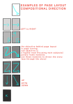
Forget “true to life” perspective outside of the establishing panel). Practice diagonal composition of objects and subjects within panels. For dynamism.
You don’t have to present the text all in one go (one paragraph or bubble). You can and should break up paragraphs, sentences, and if you need to single out words– to make smaller, more easily managed bubbles to scatter through the panel.
Less important moments have smaller panels and or lesser detail. More details (or more word bubbles) slow down time. More drawn detail also creates a concentration of values (it’s darker and sometimes combines together as one shape or mass)
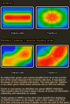
Know your light sources. Control the blacks. Control the values.
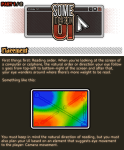
So, it’s finally done! It took me a while because UI is a bit delicate to talk about because there’s too much more to it, so I’ll talk about it in a more surface level :> Just enough to maybe help out.
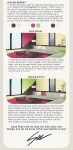
“I couldn’t find any pictures that are-” is a very lousy excuse to whitewash PoC. There are plenty of PoC models, stock images, and editorials out there. You just have to find it. Here are some of the blogs that are dedicated to PoC editorials/models that I follow. Feel free to add and suggestion more.
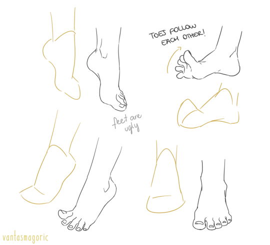
thank you a lot anon!! ( /)w() here, i made a few notes about the steps i follow while drawing feet:
^ that’s assuming you’re not drawing from a low perspective, as if the camera was on the floor or something like that!
SORRY MY HANDWRITING SUCKS and i’m not really good at explaining things bc i don’t really follow a guide and stuff so yeah BUT I HOPE IT WAS HELPFUL TO YOU!!
Feet Every artist’s mortal enemy at some point in their life
google search any topic followed by ‘filetype:ppt’ and only powerpoints will come up, or a textbook or subject name followed by ‘filetype:pdf’ to find free textbooks in pdf form
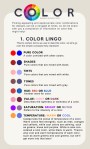
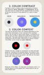
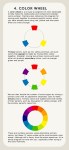
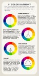
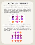
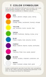
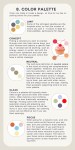
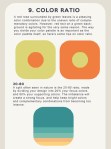
There is no right or wrong in color and design, and everyone works differently, but hopefully these tips of mine will help you find the colors that make you happiest!
Absolutely stunning color tutorial, which is great for many kinds of artists!
Be sure to reblog and follow @salison
So their great work gets the attention it deserves.
OKAY THESE ARE AMAZING AND ALL BUT WITH MY LUCK I WOULD JUST
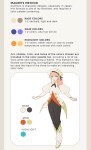
There is actually a free program everyone can download called DesignDoll which has unlimited posable models if you need more then just two or just simply don’t have the money to buy these figurines. The program is easy to work with and I’d recommend it to everybody!